Loading

Monochromatic Moodboard - Painted it Black

An independent styling project developed through a personal collaboration with a photographer, set in a minimal, studio-like environment. By stripping the visuals down to black and white, the focus shifts entirely to form, texture, and styling details—allowing the silhouettes and accessories to define the mood and narrative of the project.

Color theory & styling

Inspired by Johannes Itten’s color wheel, these projects explore color theory through the split complementary technique. The first project focuses on primary colors, emphasizing boldness and clarity, while the second examines secondary colors to create balance and visual depth. The approach blends theoretical structure with unexpected combinations and personal creative vision.

Valentino by Pierpaolo Piccioli

I explored the evolution of Valentino under Pierpaolo Piccioli through a two-part moodboard. The first part focuses on the Rockstud era, highlighting sharp silhouettes and an edgy yet refined identity, while the second examines the PP Pink collaboration as an expression of bold, modern romanticism. The project visually traces Piccioli’s transformation of the Valentino woman/man, reflecting my styling approach rooted in balance, contrast, and storytelling.

The Editorial Issue - Déesse

An editorial concept rooted in Parisian glamour, nocturnal elegance, and sensual detail. The moodboard represents the foundation of the creative process, shaping the styling narrative, visual rhythm, and overall atmosphere of the project.

Monochromatic Moodboard - Painting the Roses Red

This project explores monochromatic color-blocking through my favorite color, burgundy, and the full spectrum of red tones. Inspired by Alice in Wonderland, and specifically the Queen of Hearts and Painting the Roses Red, the moodboard merges narrative styling with color-driven visual storytelling. Red is used as an emotional tool, expressing drama, fantasy, and intensity.

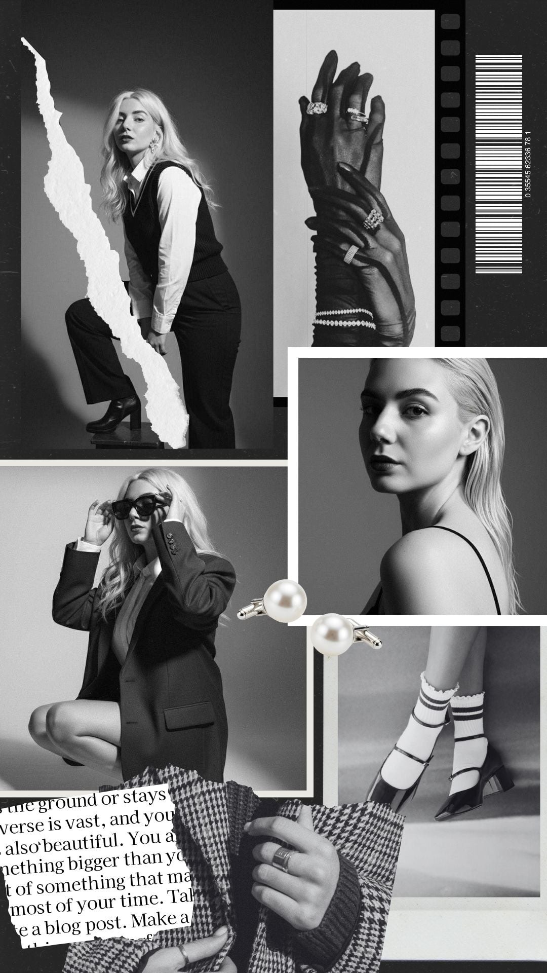
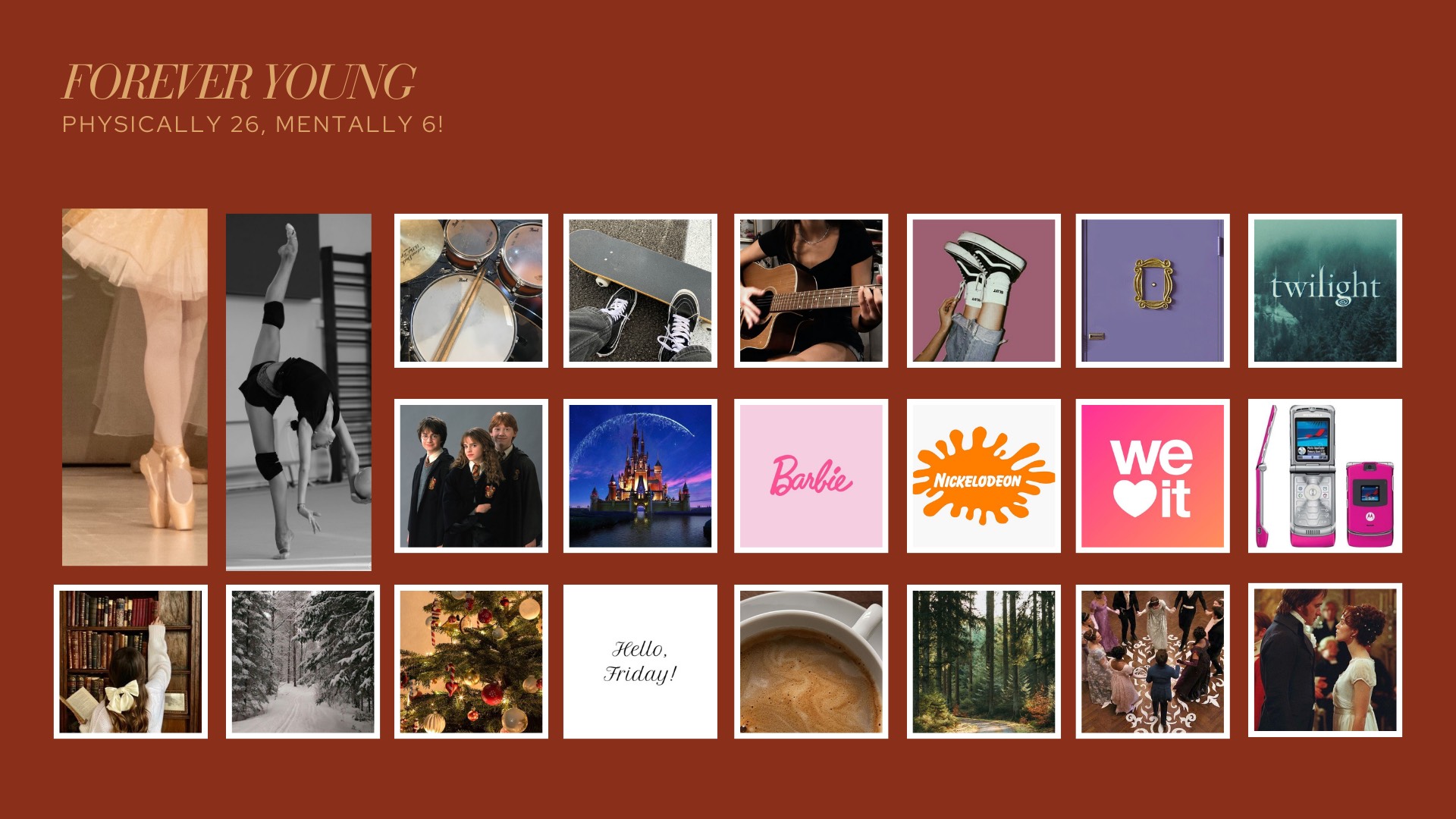
Fragments of me - Forever young

For this project, both the photoshoot and the moodboard were designed as a personal exploration of identity—an attempt to visually express who Catherine is beyond styling rules or trends. Instead of focusing on textures or silhouettes, the moodboard brings together emotions, memories, and influences: childhood references, favorite films and shows, everyday rituals, hobbies, and the small details that have shaped me over time. 
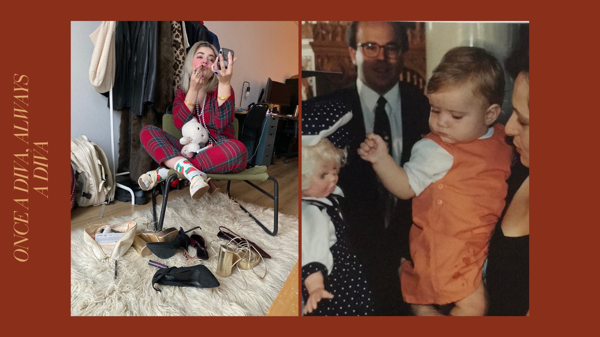
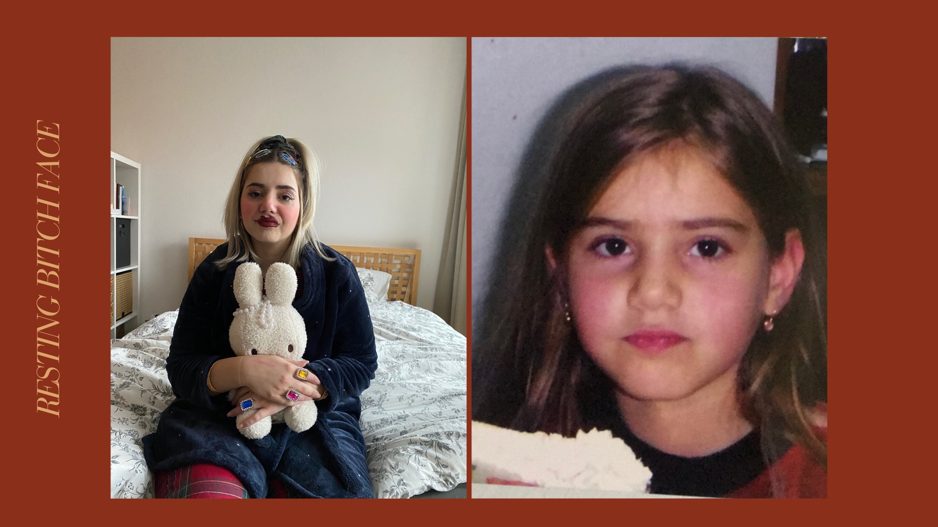
The photoshoot is built around real, unfiltered moments. In one image, I recreate the feeling of a little girl playing with her mother’s clothes and makeup. In another, the expression captures the moment of being caught after doing something mischievous. Together, the images and the moodboard form an emotional collage—one that translates memories, humor, and vulnerability into visual storytelling.